Meta Web Pro

A human­ist sans serif font designed by Erik Spiek­er­mann and pub­lished by FontShop. Meta was orig­i­nally a print font designed for small text. The same ele­ments that helps Meta stay read­able at small sizes in print helps Meta Web Pro stay read­able on screen: open aper­tures, a gen­er­ous x-height, gen­er­ous closed coun­ter­forms, and slightly loose […]

Continue Reading

Meta Serif Web Pro

A serif font designed by Erik Spiek­er­mann, Chris­t­ian Schwartz, and Kris Sow­ersby. Pub­lished by FontShop. Meta Serif (for print) was orig­i­nally designed as a com­pan­ion font to Meta. Meta Serif Web Pro is not merely a print font repack­aged for web use—it has been care­fully hinted and looks great on screen. I clas­sify Meta Serif […]

Continue Reading

Merriweather

A serif font by Eben Sorkin. I cat­e­go­rize Mer­ri­weather as an “Other Serif” font, because it does not fall neatly into any of the gen­eral his­toric cat­e­gories com­monly used to describe serif type. Mer­ri­weather grace­fully mixes-and-matches var­i­ous his­toric approaches to font design. Head ser­ifs and some ter­mi­nals feel pen-formed, while foot ser­ifs are rem­i­nis­cent of […]

Continue Reading

Just My Type

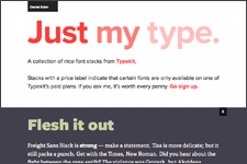
If you’re look­ing for new ideas for pair­ing web fonts, check out Just My Type by Dan Eden. The site rec­om­mends font pairs using fonts from TypeKit’s col­lec­tion. I can­not guar­an­tee that all web fonts shown are per­fect (I don’t know if they’ve all been tested cross browser for instance), but the pair­ings will cer­tainly […]

Continue Reading

Calluna Regular

A font that almost made it. A Venet­ian serif font by Jos Buiv­enga (exljbris.com), Cal­luna has a smaller x-height than Geor­gia, and works best at a gen­er­ous font-size. Cal­luna feels like an “old” font; it has pen-formed ser­ifs and ter­mi­nals. The ris­ing cross­bar of the low­er­case e is rem­i­nis­cent of early Renais­sance (Venetian/Humanist) letterforms. Unfor­tu­nately, […]

Continue Reading

Droid Serif

Designed by Steve Mat­te­son, Type Direc­tor of Ascen­der Corp. Droid Serif is a tran­si­tional font; it feels more “ide­al­ized” than “writ­ten.” It has a slightly con­densed, “square-feeling” bowl, con­trast between thick and thin strokes, a ver­ti­cal stress, and ter­mi­nals and ser­ifs that don’t look pen-formed. It has a sig­nif­i­cantly larger x-height than Georgia. Accord­ing to […]

Continue Reading

Droid Sans

Designed by Steve Mat­te­son, Type Direc­tor of Ascen­der Corp. Droid Sans is a human­ist sans serif font. Ascen­der describes it as hav­ing “an upright stress, open forms and a neu­tral, yet friendly appear­ance.” Its open aper­a­tures, slightly tapered spurs, and a double-decker g all make Droid Sans feel slightly more hand-written than man­u­fac­tured. It has […]

Continue Reading
DejaVu Serif

A slab serif font by Tavmjong Bah, based on the Vera fonts. Unlike tra­di­tional slab serif fonts, DejaVu has con­trast between thick and thin strokes. The bowls are slightly square, and the large x-height means it remains read­able at smaller sizes. DejaVu tests well across browsers, though there are some let­terspac­ing issues in Safari on […]

Continue Reading

Le Monde Courrier

A serif font designed by Jean François Porchez of Porchez Typo­fonderie, Le Monde Cour­rier attempts to “re-establish a style halfway between writ­ing and printing.” First, let me say, I love this font! The over­all struc­ture and sys­tem (when viewed on Safari, Chrome, Opera or Fire­fox from my mac) is gor­geous. I want to use it. […]

Continue Reading

Utopia Standard

A tran­si­tional font by Robert Slim­bach, Utopia was orig­i­nally designed for print. It is part of the Adobe Orig­i­nals series. Utopia has a ver­ti­cal stress and sig­nif­i­cant con­trast between thick and thin strokes. The strong ver­ti­cal strokes and the slightly square bowl give the font a “square” feel­ing when used for text. It has a […]

Continue Reading