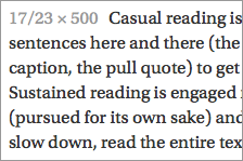
A transitional font by Robert Slimbach, Utopia was originally designed for print. It is part of the Adobe Originals series.
Utopia has a vertical stress and significant contrast between thick and thin strokes. The strong vertical strokes and the slightly square bowl give the font a “square” feeling when used for text. It has a similar x-height and apertures to Georgia. Utopia’s letterspacing is slightly tighter, so I personally find it easier to read at larger sizes.
Utopia comes in 6 styles. Even though it was originally designed for print, Utopia is well hinted and tests well across browsers.

